
INTRO
SYNRC CSS uses HTML5 section elements for structuring both documents and applications. The main goal is to have one unified solid CSS as ground for both ERP applications and easy to read articles, with custom CSS layering for colors, right-to-left languages, etc. In our model we structure section inside article in both aside and main elements.
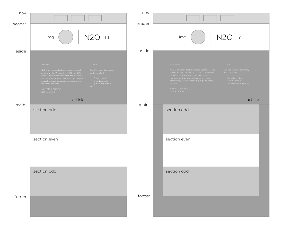
On the right side you can see maximum allowed width (initial or PC mode). With width decreasing eventually borders disappears and article edges got sticky with zero margins. In this (intermediate or Pad mode) CSS has three addition subsizes. The lowest one, with minimal sizes (terminal or Mobile mode) is specian because should lack borders for figure img, figure code and figure pre (borders could be visible only in colorful scheme and lack in blank). Both indermediate and terminal modes are depictured on left side of the picture.
SIZES
SYNRC CSS supports folowing size:
— more that 1280px (initial mode)
— 768px to 1280px (intermediate #1)
— 550px to 768px (intermediate #2)
— less that 550px (terminal mode)
FILES
BLANK.CSS
Blank CSS contains basic definitions for termninal mode in root and intermediate and initial modes as @media overlays. As a prelude we set Geometria font and Zima Blue color for heading accent in a basement.
Booting body, h1, h2, h3, h4:
* { box-sizing: border-box; margin: 0; padding: 0; }
@font-face { src: url('https://tonpa.guru/Geometria-Light.otf');
             font-family: 'local'; font-weight: normal; font-style: normal; }

body { background-color: white; font-family: 'local', sans-serif; font-size: 16px; }
hr { margin-top: 10px; margin-bottom: 10px; }
h1, h2, h3, h4 { font-weight: normal; border-left: 2px solid #5BC2E7; }
Booting nav:
nav { padding: 20px 0 20px 0; display: block; position: fixed;
      width: 100%; background-color: white; display: float;
      text-align: center; align-items: center; }

nav a:visited { color: #5BC2E7; }
nav a:hover { border-bottom: 2px solid #5BC2E7; }
nav a { font-size: 16px; border: 2px solid #dedede; cursor: pointer;
        text-decoration: none; margin: 5px 5px; padding: 7px 12px;
        text-align: center; color: #5BC2E7; }
Booting header:
header { padding-top: 80px; padding-bottom:40px; text-align: center; }
header img { margin-right: 25px; margin-bottom:-35px; width: 100px; }
header h1 { line-height: 1; margin: 40px 0px 40px 0px; padding-left: 20px;
            font-size: 38px; display: inline-block; text-align: left; }
Booting aside:
aside h3 { font-size: 28px; text-transform: uppercase; color: #5BC2E7;
      margin: 0px; padding: 20px 0 10px; margin-bottom: 20px; border-left: none; }
aside div { color: black; }
aside img { width: 20px; vertical-align: middle; }
aside a { text-decoration: none; color: #5BC2E7; }
aside a:visited { color: #5BC2E7; }
aside a:hover { background: rgba(255, 255, 255, 0.3); }
aside { text-align: center; padding: 0 10px 100px; }
aside section { margin: auto; max-width: 650px; padding: 20px 0 0 0;
                display: inline-block; vertical-align: top; text-align: left;
                padding-right: 30px; }
Booting main:
main section { padding: 20px 0px 20px 0; text-align: left; }
main section:nth-of-type(even) { background-color: white; }
main p { max-width: 850px; margin: 20px; line-height: 1.3; }
main ul { list-style-type: none; max-width: 850px; margin: 20px; }
main b { color: #121212; font-weight: bold; }
main h3 { line-height: 1; font-size: 32px; padding-left: 20px; max-width: 850px; }
main h4 { line-height: 1; font-size: 24px;  padding-left: 20px; max-width: 850px; }
main a:visited { color: #5BC2E7; border-bottom: 1px solid #5BC2E7; }
main a:hover { background: rgba(71, 144, 256, 0.13); }
main a { color: #5BC2E7; text-decoration: none; margin:0;
     border-bottom: 1px solid green; }
Booting figure:
figcaption  { padding: 5px 20px; text-transform: uppercase; font-size: 1rem; }
figure      { margin: 10px auto; max-width: 100%; text-align: center; }
figure img  { max-width: 100%; padding: 0px; }
figure code { font-family: monospace; font-size: 12px;
              display: block; max-width: 100%; overflow-x: auto; padding: 10px;
              background-color: white; white-space: pre; text-align: left; }
Media min-width 550px:
nav { padding:10px 0 10px 0;display:flex;justify-content:center;line-height:1; }
nav a { font-size: 18px; min-width: initial; }
header h1 { font-size: 30px; }
figure { max-width: 100%; }
figure code { max-width: 100%; font-size: 12px; }
figure img  { max-width: 100%; border: 0px solid #E8E8E8; }
Media min-width 768px:
body { font-size: 18px; }
li { list-style-position: inside; }
header h1 { font-size: 50px; margin: 70px 0 100px; }
main h3 { font-size: 36px; margin: 40px auto; }
figure { max-width: 70%; }
figure code { max-width: 100%; font-size: 14px; }
figure img  { max-width: 100%; border: 10px solid #E8E8E8; }
Media min-width 1280px:
li { list-style-position: outside; }
body { font-size: 20px; }
header h1    { font-size: 70px; margin: 100px 0 150px; }
main section { max-width: 1200px; margin-left: auto; margin-right: auto; }
main h3 { font-size: 44px; }
figure  { max-width: 70%; }
figure code { max-width: 100%; font-size: 16px; }
figure img  { max-width: 100%; border: 10px solid #E8E8E8; }
DROPDOWN.CSS
Dropdown button is used for language selection in nav menu bar.
.show         { display:block; }
.dropbtn      { cursor: pointer;  }
.dropdown     { display: inline-block; color: #5BC2E7;}
.dropdown > a { padding: 5px 12px }
.dropdown-content a { display: block; background: white; }
.dropdown-content   { margin-top: 10px; display: none; margin-left: -5px;
                      padding: 5px; position: absolute; }
RTL.CSS
RTL is a simple overlay for left-to-right languages.
h1, h2, h3, h4 { padding-right: 20px; border-left: none;
                 direction:rtl; text-align: right; }

header h1 { border-left:none;border-right:2px solid #00b8cf;padding-right:20px; }
header img { padding-left:0px;margin-right:0px;margin-left:20px;height:100px; }
aside div { direction: rtl; text-align: right; }
aside h3 { direction: rtl; text-align: right; margin-right: -0px;
       margin-left:0; border-right: none; }
ZIMA.CSS
Zima Blue is a color scheme created by Arseniy Bushyn.
h2, h3 { color: #5BC2E7; }
nav, body, header { background-color: #ECF8FE; }
main, footer { background-color: #1A70A2; }
footer { color: #5BC2E7; }
nav a { background-color: #fff; color: #5BC2E7; }
nav a:visited { color: #5BC2E7; }
aside { background-color: #1A70A2; }
aside h3 { color: #5BC2E7; }
aside div { color: #F8F8F8; }
aside a, main a, main a:visited { color: #5BC2E7 }
figure code, figure pre { color:#c2d5ed; background-color:#2b3643 }
main b { color: #121212; }

@media(min-width: 550px)  { figure code { border: 10px solid #E8E8E8; } }
@media(min-width: 768px)  { figure code { border: 10px solid #E8E8E8; } }
@media(min-width: 1280px) { figure code { border: 10px solid #E8E8E8; } }

main section {  background-color: #ECF8FE; }
main section:nth-of-type(even) {
  background-color: white;
  margin-left: auto;
  margin-right: auto;
  max-width: 1200px;
}